We loved working with PG House team on their Branding & Website. They are amazing people who understands business & people just with their first look
Our Role
Creating Strategy
Research
Wireframing
User Flow
UX/UI Design
Style Guide
PgHouse's Story
Mr Deepak & his wife owns & runs this PG business in the center heart of Pune City with more than 60 beds. First he started with the pamplate & word of mouth marketing & even got traction, but being a proactive business person he also didn’t wanted to lose the online game, hence appointed The Clever Space to level up their online game.
The Challenges
Zero conversions (form enquiries or calls) from the website
Not having a right Brand or Design Strategy
Current website was irrelevant & less human
He wasn't able to edit any part of the system
And much more!
Design Process
Empathize
User PersonaBrand StoryEmpathy Mapping
Define
Market AnalysisMood-BoardDesign System
Ideate
User FlowSite MapWireframing
Visual Design
Hi-fi MockupsClickable PrototypeDevelopment
Validate
User TestingIntegrations
Full story in 15mins
1. Research.
User Persona & Stories Empathy Mapping Pain Points
Demograph
Name: Gaurav Age: 25 yrs Work: Works in an IT Company Earning: 20 - 60K/Month
His Needs
It's quite exhausting when looking for a good & affordable place. Cleanliness is a top priority Amenities Good Location
2. Design System
Colors
In Pghouse.in we are using colors for texts & majorly Indigo is used for headlines, for alternate headlines we are using Eagle Green.
The other elements are yellow in color for better harmony.
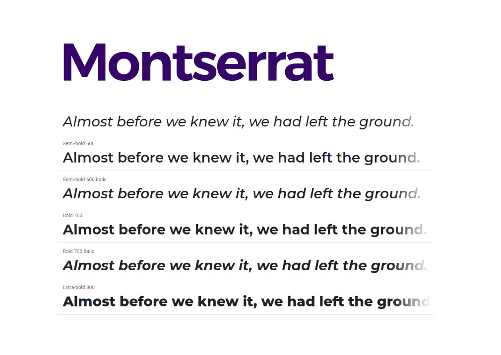
We are only using Montserrat (Google non royalty font) for Headlines & text both.
Because of this being simple & bit spacious as well as subtly playful in appearance.
In addition it has many variations which helps in making Hierarchy better
3. Ideating & Planning
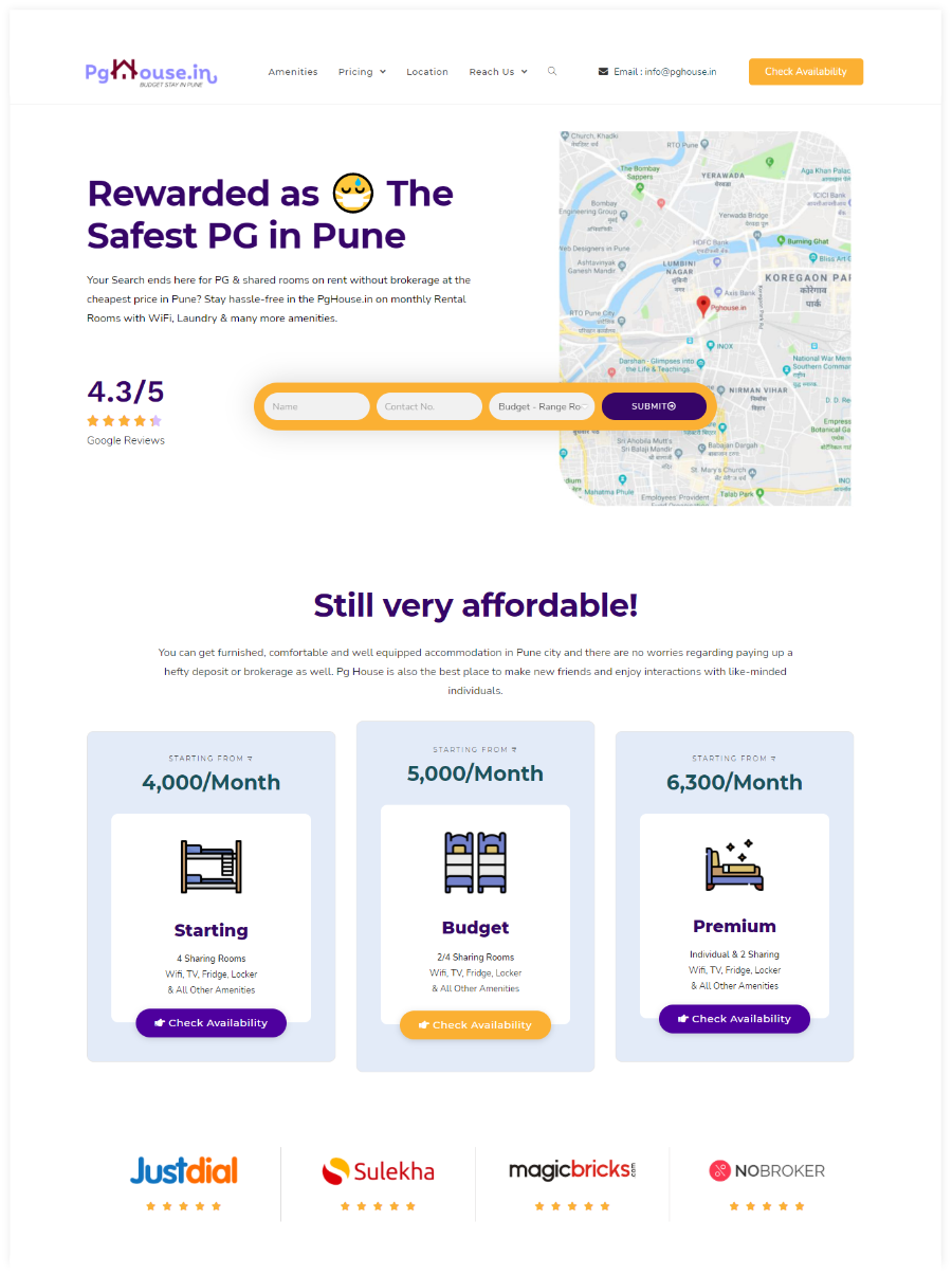
While understanding the User’s journey we know that the visitors have a clear goal i.e. to know what is the price, how rooms look like & where is it located (how much distance do I have to travel from my workplace), what are the amenities so we’ve tried answering all of these with an interesting & playful design.
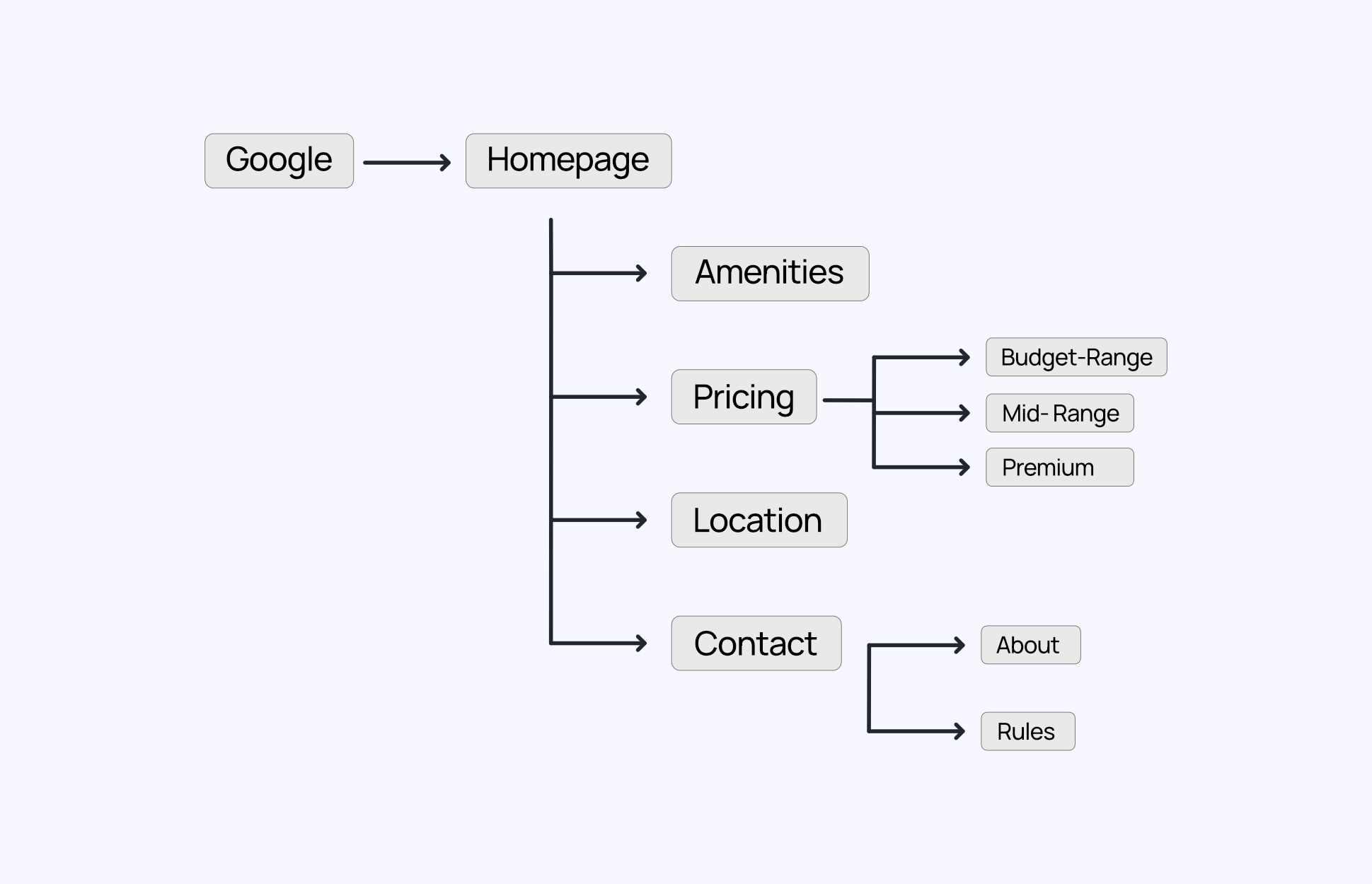
Information Architecture
Tried keeping the navigation for the user so simple & to the point.
There is a single Pricing Page deliberately kept so as to get easy view for comparing the options, but at the same time we’ve divided the pricing system in the navigation menu for quick results
Wireframing
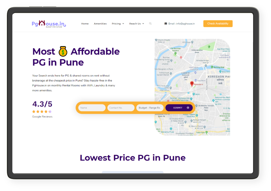
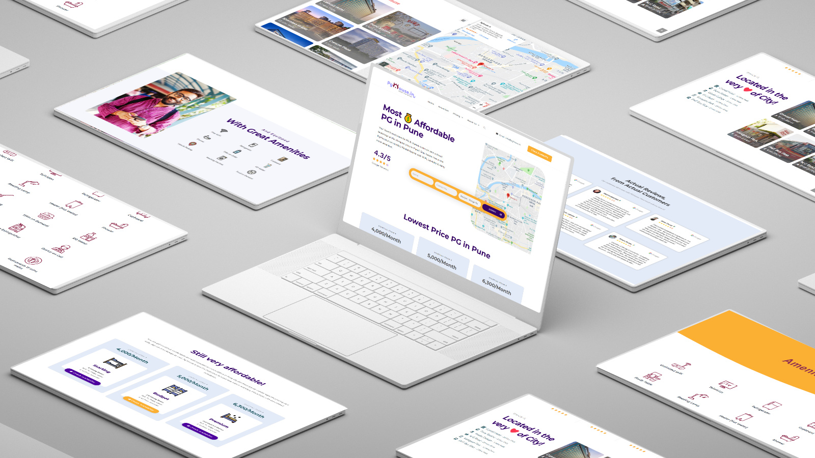
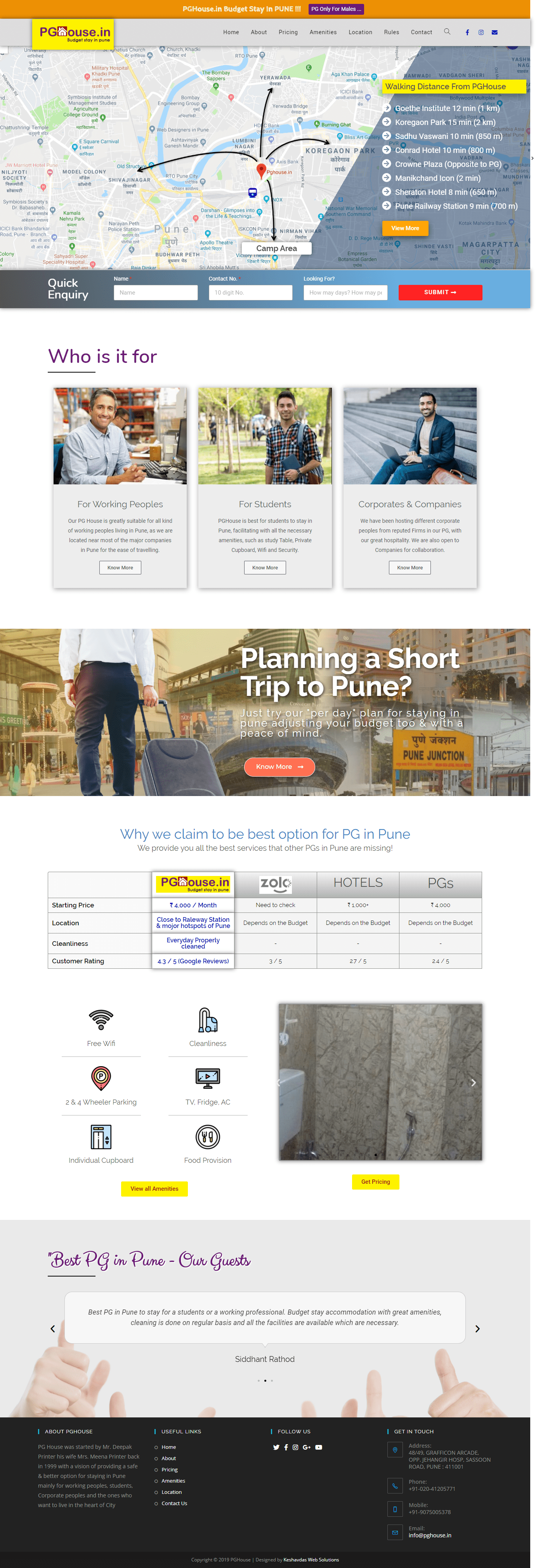
4. The final Design
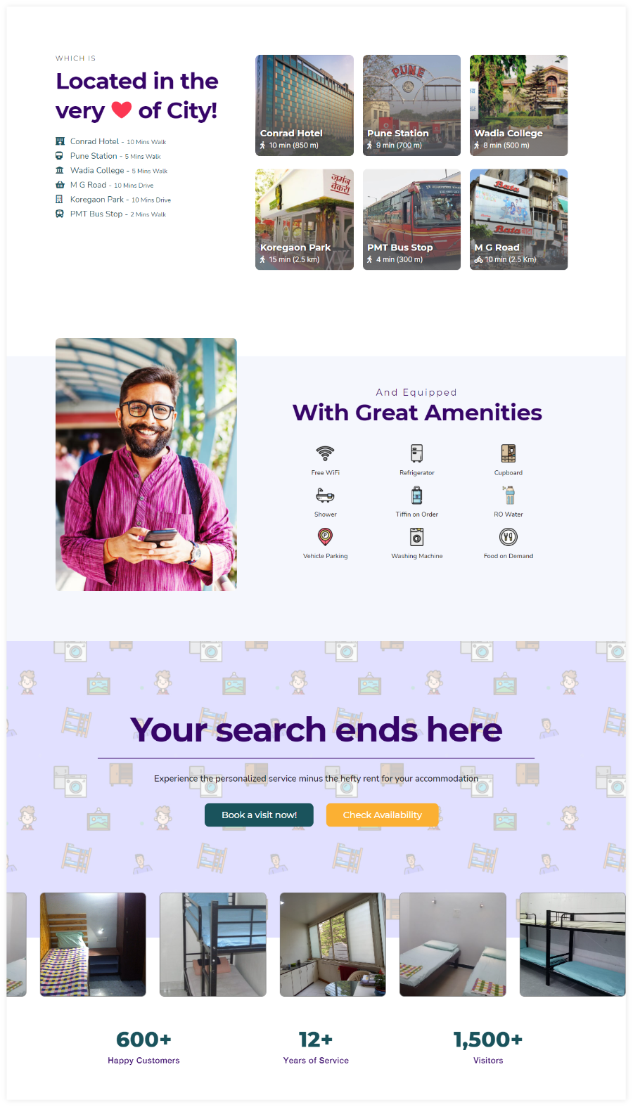
This is the final & current version of Home Page of PG House website, we made a quite good & lots of changes from the wireframing stages as and when needed. The Users are first & foremost concerned about the pricing & that’s why it is kept the reach of a single scroll.
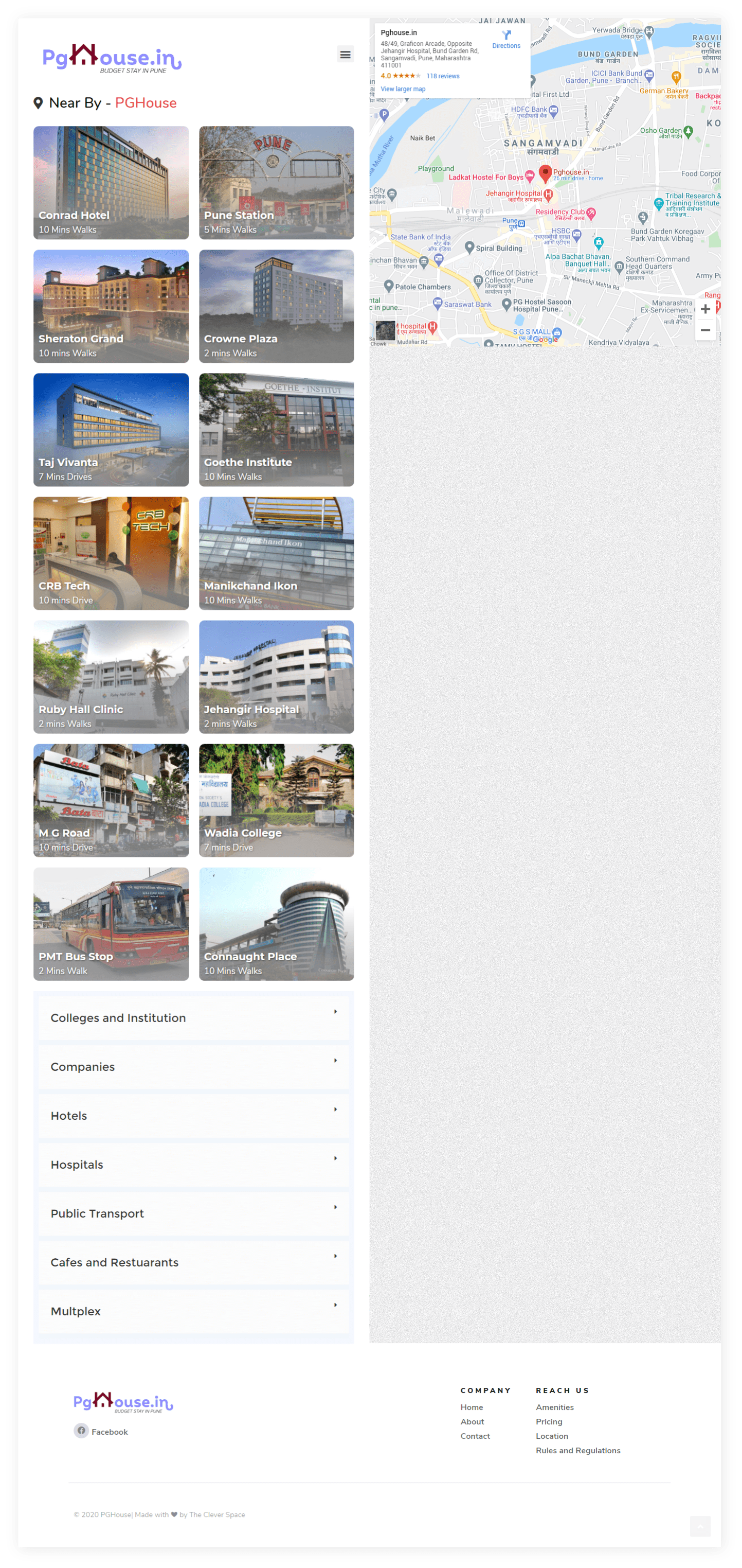
Location Page
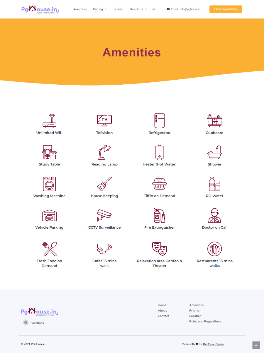
Amenities Page
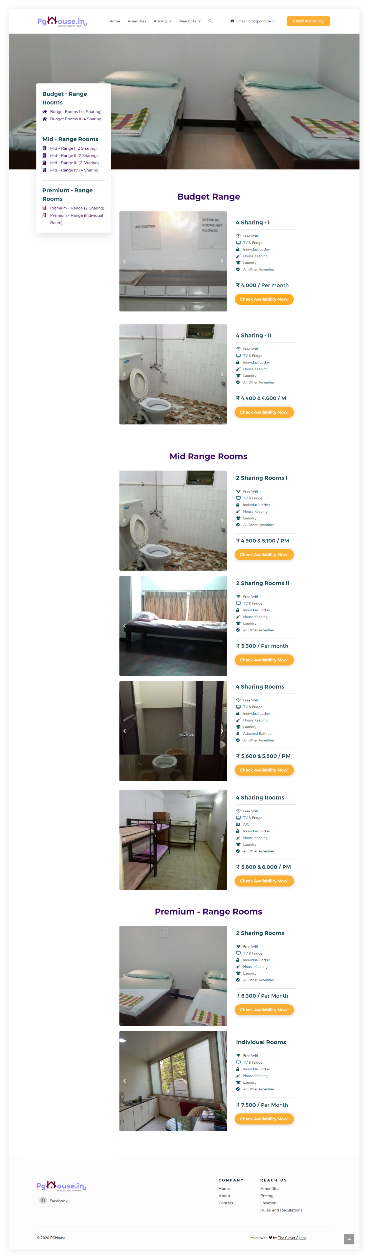
Pricing Page
The Versions
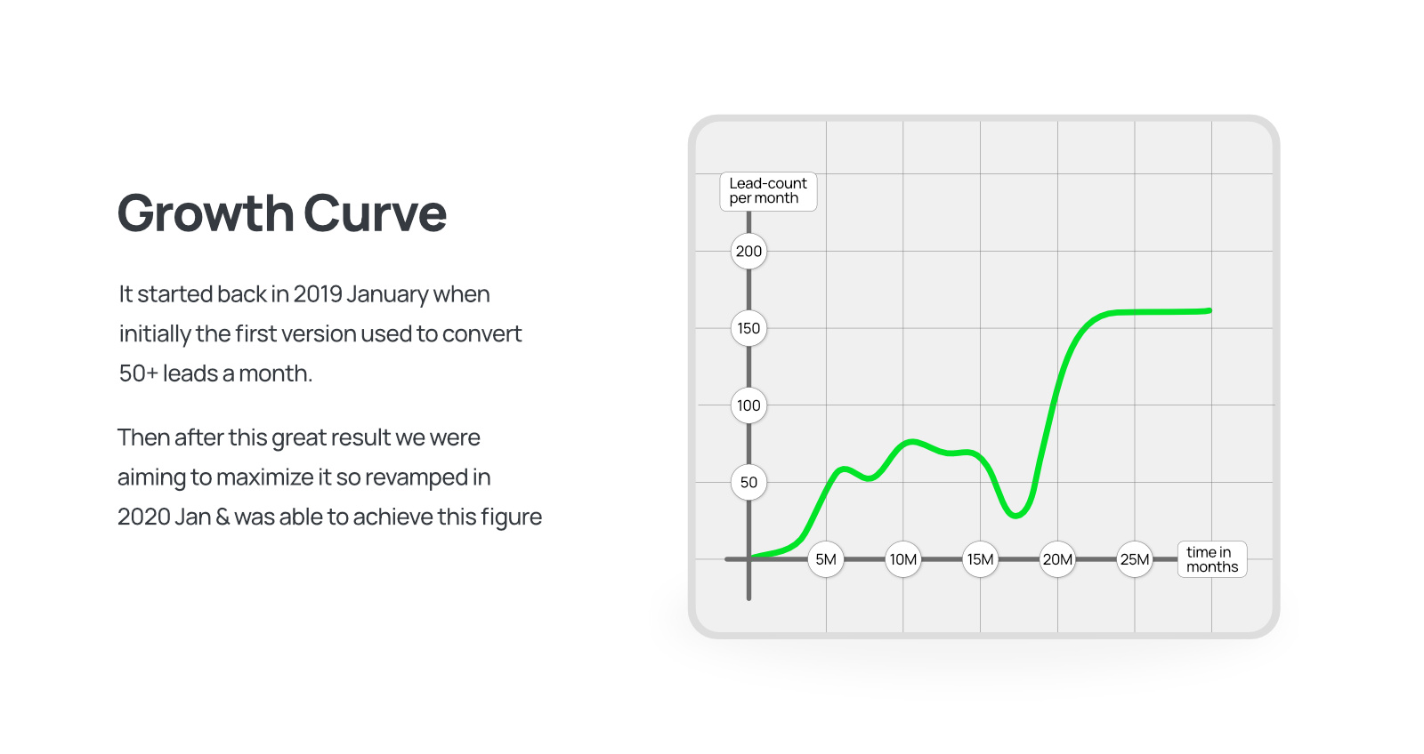
We did it twice
The first image is of the first Design which was even doing well, but wasn’t upto the mark & was missing some major instruments for increasing conversions.
So we came up with the new design & flow after an year of having old website & which is currently doing a great job for PG House