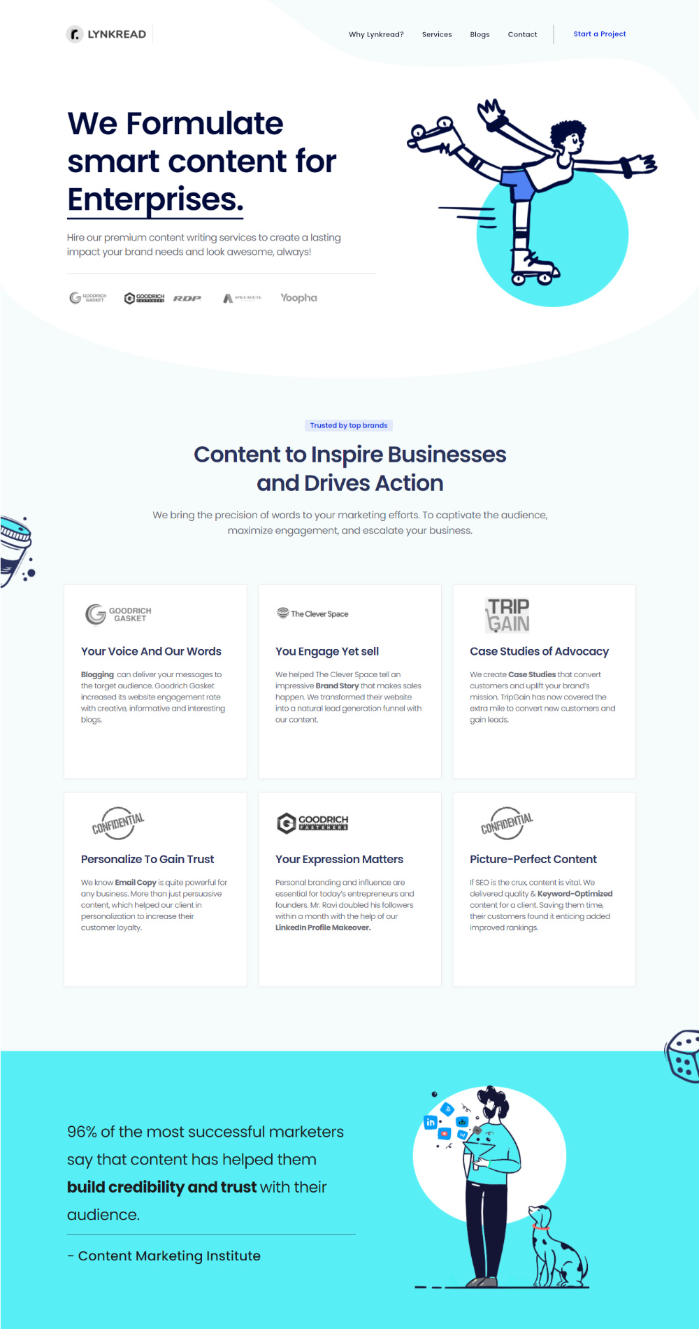
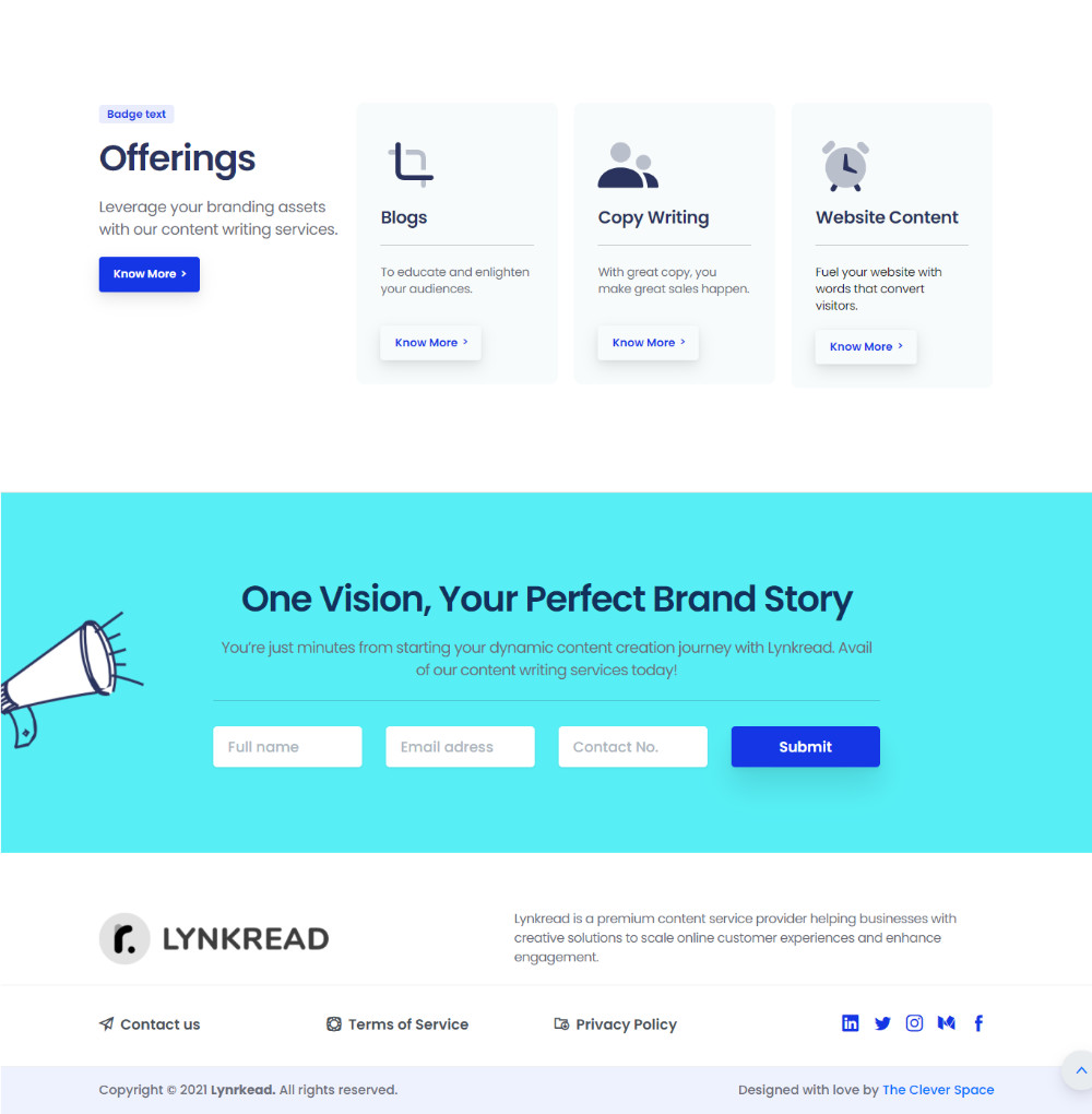
Lynkread is a content agency that started their journey a year ago, now they are all set to see the next phase & hence approached for a website that delivers & stands them out.
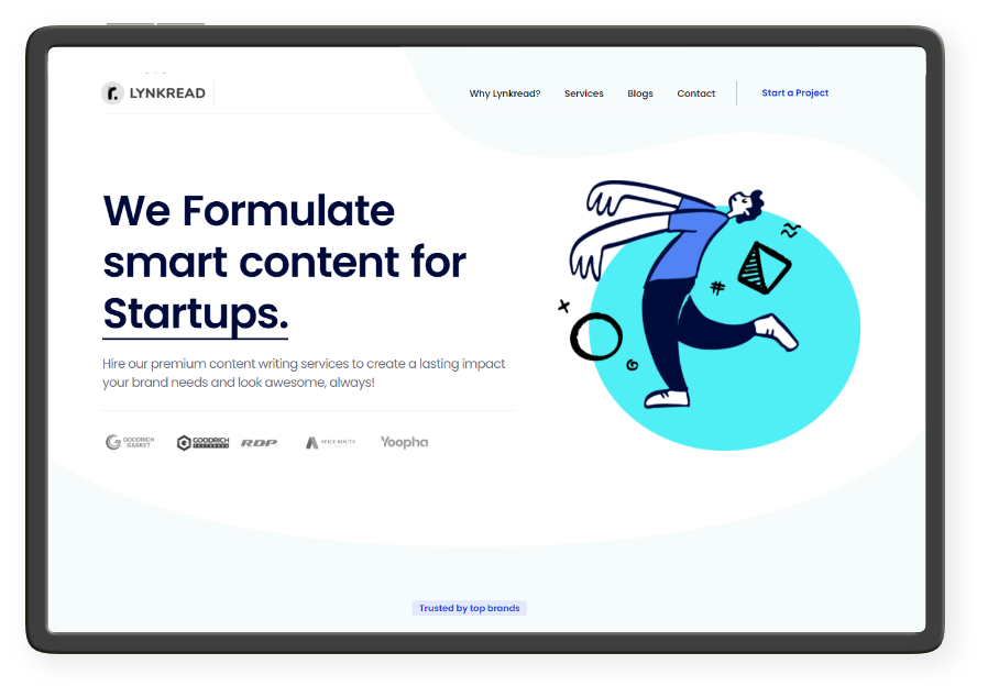
In simpler terms Lynkread is a joint where creativity meets professionalism. The agency helps ambitious brands & leaders who want to define and drive purpose, inspire their audience & build brands with loyal fans. Mr Bala the founding person of the agency is good friend who thought to make a move & level up their customers experience on the various touchpoints.
A summery here Smitha is undoubtedly amazing at her work, she doesn’t just understands her clients but lives through them.
A summery here Smitha is undoubtedly amazing at her work, she doesn’t just understands her clients but lives through them.
After the discovery session we came to a conclusion that Lynkread is mixture of Professionalism, efficiency & untold creativity & after a few iterations in the colors we came to these amazing ones
Two Primary colors and rest 2 light & dark contrast for each primary colors we are using.
Blue is the color of professionalism, corporate, Saas & Startups. And this shade looks very active with a soothing effect on eyes
This Shade we are using for bringing harmony & adding a different taste & adds the creative factor of the brand in the whole design.
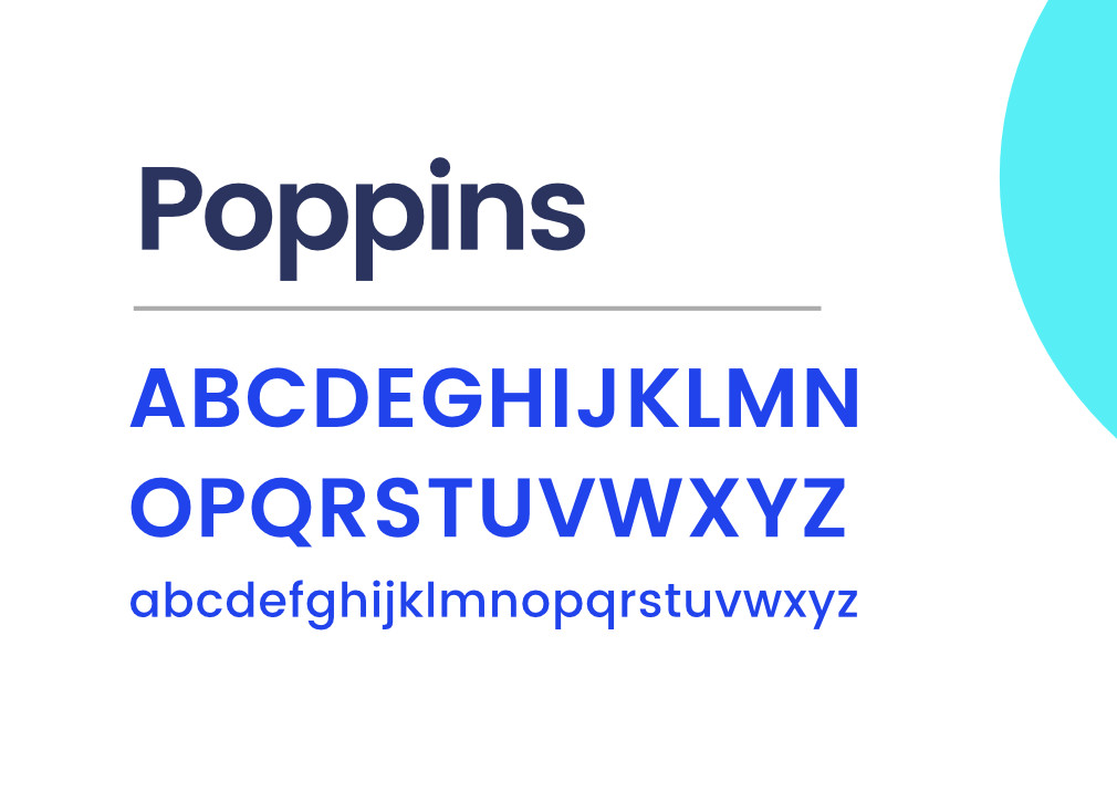
Using only one Font Type for the Headings & Smaller Texts.
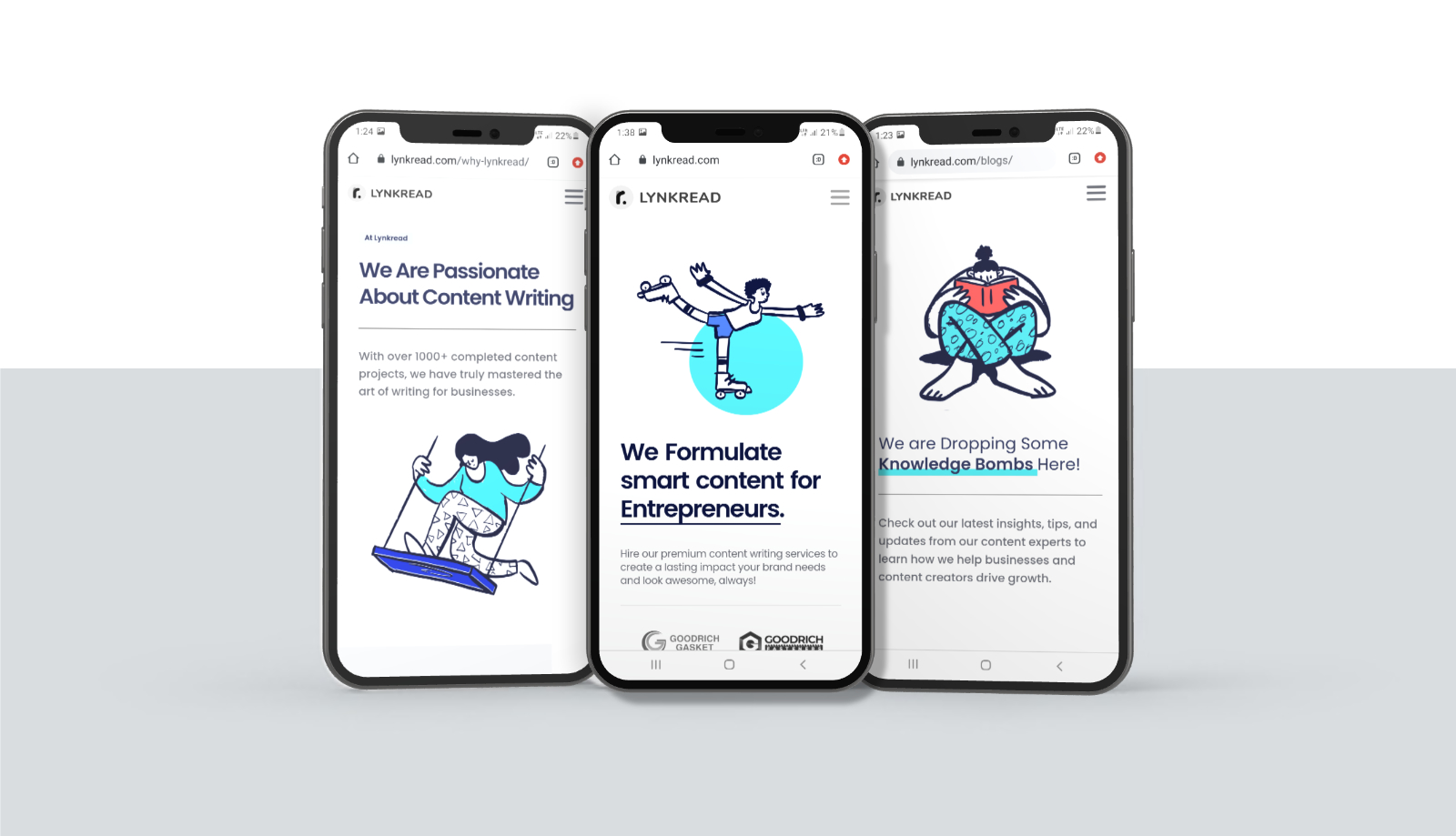
We are using Poppins a Sans font which looks amazing on mobile.
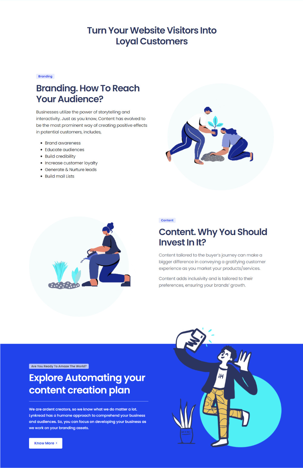
As per the visualization of Lynkread, we wanted to be simple, modern & minimal yet creative.
So we went for 2d doodles with the contrasting color combination of the brand itself



We designed the Daybest's visual identity from the ground up, capturing the new companies excitement and value in a new logo and brand style guidelines. We then built a highly-effective website that helps educate leads and convert customers.
Using two Font Types
Rozha One for the Headings
Caros Soft for Smaller Texts
This combination of Sans-Serif & Sans font is bringing harmony in the design itself, in addition to it both are bringing their characteristics &
A summery here Smitha is undoubtedly amazing at her work, she doesn’t just understands her clients but lives through them. A summery here Smitha is undoubtedly amazing at her work, she doesn’t just understands her clients but lives through them.
